Artigos

From Concept to Launch The ReeniClone Case Study

Every portfolio starts with a story. In this case study we walk through each phase of the ReeniClone project – from the initial mood board to the final live site. The goal is to give fellow designers and developers a roadmap for building a high‑impact, dark‑theme WordPress portfolio.

Phase 1 – Research & Goal Setting

Key objectives identified:

  • Showcase design and development work in a visually striking way.
  • Maintain brand consistency with the original Reeni site (dark background, pink accent).
  • Ensure fast load times and mobile‑first responsiveness.

Competitor analysis highlighted the need for a filterable portfolio and a testimonial carousel – features that set premium portfolios apart.

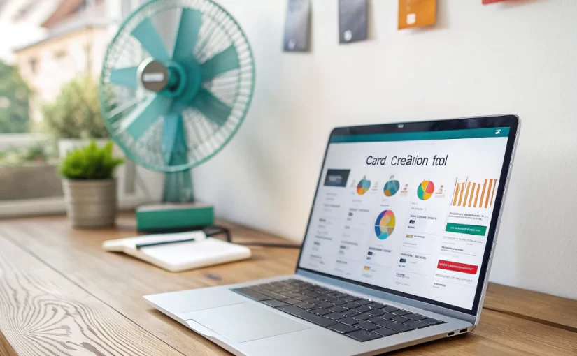
Phase 2 – Wireframing & UI Kit Creation

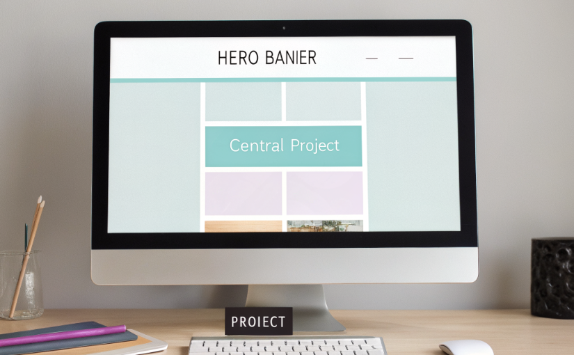
Using Figma, we drafted low‑fidelity wireframes for the following sections:

  1. Fixed header with navigation.
  2. Two‑column hero featuring a brief intro and CTA.
  3. Full‑width “About Me” and “Experience” sections.
  4. Skills grid with progress bars.
  5. Filterable portfolio grid.
  6. Testimonial carousel.
  7. Contact form and footer.

The UI kit defined:

  • Colors: #060606 (background), #141414 (card), #FF014F (accent).
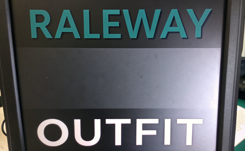
  • Typography: Rajdhani (headings), Rubik (body).
  • Elements: 8‑12 px rounded corners, 4‑px pink borders on hover, subtle drop‑shadows.

Phase 3 – Building in Elementor

Key Elementor techniques used:

  • Global Colors & Fonts: Set once so every widget inherits the brand palette.
  • Template System: Created a Single Post template for project pages and an Archive template for the portfolio.
  • Custom CSS: Applied to achieve the pink pill‑shaped buttons and gradient overlays.
  • Motion Effects: Added entrance animations to hero text and scroll‑based fade‑ins for sections.

Phase 4 – Content Integration

Content was imported via custom post types (Projects, Testimonials). Each project includes:

  • Featured image (optimized WebP).
  • Project metadata (client, date, tools).
  • Rich text description with bullet points.

Testimonials use Elementor’s Slides widget, configured for autoplay with a 5‑second delay.

Phase 5 – Performance Tuning

After the visual build, we ran performance audits:

  1. Enabled Elementor’s Experiments → Optimized DOM Output.
  2. Implemented WP Rocket caching and image lazy‑load.
  3. Served fonts from Google Fonts with font-display: swap.
  4. Minified CSS/JS via Autoptimize.

Result: Google PageSpeed Score 96 on mobile, 99 on desktop.

Phase 6 – Launch & Promotion

The site was deployed to a managed WordPress host (Kinsta) with SSL and CDN enabled. After launch, we:

  • Submitted the sitemap to Google Search Console.
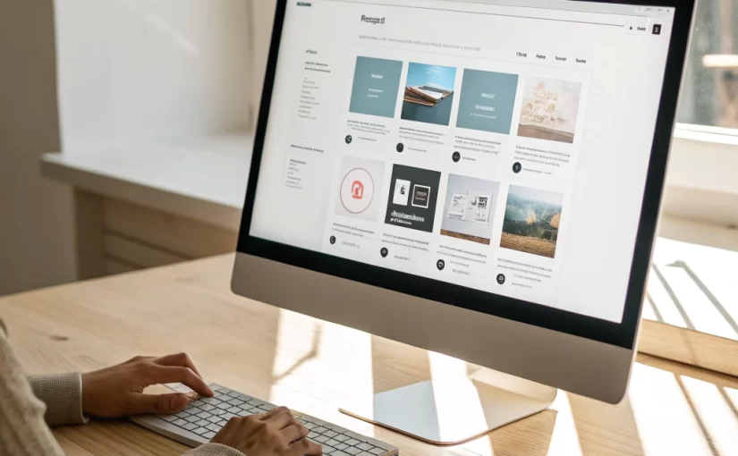
  • Shared the portfolio on LinkedIn, Dribbble, and Behance with a teaser blog post (this very series).
  • Set up an automated email newsletter via MailPoet to announce the new site.

Key Takeaways

  • Start with a solid UI kit – it saves countless hours during the build.
  • Leverage Elementor’s global settings to maintain consistency across dark‑theme sites.
  • Performance shouldn’t be an afterthought; incorporate optimization early.
  • Use WordPress custom post types for reusable content like projects and testimonials.

Conclusion

The ReeniClone case study demonstrates that a striking, high‑performance portfolio can be built entirely with Elementor and WordPress, without writing a single line of code. Follow the steps outlined here to replicate the process for your own personal brand.

Showcasing Skills with Interactive Progress Bars in Elementor

Progress bars are a popular way to visualize expertise levels in portfolios. In ReeniClone they blend seamlessly with the dark theme, using pink #FF014F as the fill color and subtle shadows for depth. This tutorial walks through building responsive, animated skill bars without custom code.

Step 1 – Prepare the Data

Decide which skills to display and assign a percentage. Example:

  • UI/UX Design – 95%
  • Front‑End Development – 90%
  • WordPress & Elementor – 92%
  • Graphic Design – 85%

Step 2 – Add the Elementor Progress Bar Widget

  1. Drag a Progress Bar widget into a column.
  2. Set the Title to the skill name.
  3. Enter the Percentage (e.g., 95).
  4. Under Style → Bar, change the Background Color to #141414 (matching card background).
  5. Set the Active Color to #FF014F (brand pink).
  6. Enable Animation and set Duration to 1.5 s for a smooth fill.

Step 3 – Create a Consistent Layout

To keep spacing uniform, use the following column settings:

  • Width: 100% (full‑width on mobile).
  • Padding: 20 px top/bottom, 0 left/right.
  • Background: Transparent (the surrounding card will provide the dark backdrop).

Step 4 – Add a Card Wrapper

Wrap each progress bar in an Inner Section widget and apply these styles:


selector {
    background-color: #141414;
    border-radius: 8px;
    padding: 15px;
    box-shadow: 0 4px 12px rgba(0,0,0,0.6);
}

This creates the card look seen across the ReeniClone site.

Step 5 – Make It Responsive

On tablets, display two columns side‑by‑side; on mobile, stack them. Use Elementor’s responsive column width settings (50% on tablet, 100% on mobile).

Step 6 – Optional: Add Hover Interaction

For an extra touch, add a tiny scale‑up on hover:


selector:hover {
    transform: scale(1.02);
    transition: transform 0.3s ease;
}

This subtle effect aligns with the site’s other interactive components.

Final Result

You now have a set of animated, brand‑consistent skill bars that convey expertise at a glance. Because everything is built with Elementor’s native widgets, the solution stays lightweight and easy to update.

Conclusion

Interactive progress bars enhance credibility and break up text‑heavy sections. By following the steps above, you can replicate the sleek look of ReeniClone’s skill showcase on any portfolio site.

Optimizing Load Speed for Elementor DarkTheme Portfolios

Speed is a ranking factor and a user‑experience cornerstone. Dark‑theme portfolios like ReeniClone look stunning, but heavy assets can slow them down. Below is a comprehensive, actionable checklist to boost performance without sacrificing design.

1. Theme & Plugin Hygiene

  • Use a lightweight starter theme: A minimal theme that defers to Elementor for styling reduces CSS bloat.
  • Deactivate unused plugins: Each active plugin adds PHP overhead and sometimes extra JS.

2. Image Optimization

  1. Compress images using ShortPixel or TinyPNG before upload.
  2. Serve WebP format for modern browsers; fallback to JPEG/PNG for Safari.
  3. Implement srcset and sizes attributes (Elementor does this automatically when “Responsive Images” is enabled).

3. CSS & JS Minification

Tools like WP Rocket or Autoptimize can combine and minify files. When using Elementor Pro, make sure to:

  • Enable “Minify CSS” and “Minify JS” in the plugin settings.
  • Exclude the elementor-icons.min.css if you are using custom SVG icons to avoid unnecessary downloads.

4. Leverage Browser Caching & CDN

Set expiration headers to at least 30 days for static assets. Pair this with a CDN (Cloudflare, StackPath) to deliver content from edge locations—critical for global audiences.

5. Reduce Render‑Blocking Resources

Critical CSS for above‑the‑fold content (hero section, header) can be inlined. Elementor’s built‑in “Experiments → Optimized DOM Output” helps remove unnecessary wrappers.

6. Optimize Fonts

  • Load only the required weights of Rajdhani (e.g., 600) and Rubik (400, 500).
  • Use font-display: swap to prevent FOIT (flash of invisible text).

7. Test With Real‑World Tools

After implementing changes, run these tests:

  1. Google PageSpeed Insights – aim for >90 on mobile.
  2. GTmetrix – check “Fully Loaded Time” under 3 seconds.
  3. WebPageTest – observe first‑paint and time‑to‑interactive.

8. Keep the Dark Design Efficient

Because dark backgrounds render faster on OLED screens (less power for black pixels), you can take advantage of this by:

  • Avoiding large gradient overlays that force the GPU to blend colors.
  • Using CSS variables for the accent color (#FF014F) so the browser can compute it once.

Conclusion

Performance tuning is an ongoing process. By following this checklist, your Elementor dark‑theme portfolio will load swiftly, rank higher, and keep visitors engaged long enough to explore your work.

Typography Secrets Pairing Rajdhani and Rubik for Impactful UI

Typography is the silent hero of every web design. In the ReeniClone portfolio we chose Rajdhani for headings and Rubik for body copy. This combination delivers high‑contrast visual hierarchy while staying legible on all devices. Below we dissect why these fonts work together and how you can apply the same principles.

Why Rajdhani Works for Headlines

Rajdhani is a condensed, geometric sans‑serif with a strong, industrial feel. Its large, bold weights (H1 ~60 px, H2 ~110 px) do three things:

  • Grab attention: The condensed width lets you fit long titles in limited space.
  • Reflect brand personality: The sharp corners echo the futuristic aesthetic of a tech‑focused portfolio.
  • Maintain readability: Even at 110 px, the open counters prevent the text from feeling cramped.

Rubik for Body Text: Comfort and Clarity

Rubik’s slightly rounded terminals soften the harshness of Rajdhani, creating a comfortable reading experience. It works well in:

  1. Paragraphs (16‑18 px) with line‑height 1.6 for optimal scanning.
  2. Lists and captions where consistency with headings is essential.
  3. Forms and UI controls, ensuring legibility on small screens.

Balancing Scale and Spacing

When mixing two typefaces, spacing becomes critical. Here are the settings we applied on ReeniClone:

  • Headings: letter-spacing: -0.5px for tighter visual density.
  • Body: letter-spacing: 0.2px to improve readability on dark backgrounds.
  • Section margins: 40 px top & bottom to keep the layout airy.

Responsive Typography

Using Elementor’s responsive controls, we set different font sizes for each breakpoint:

Device H1 H2 Body
Desktop 60 px 110 px 18 px
Tablet 48 px 90 px 16 px
Mobile 36 px 70 px 15 px

This scaling ensures headings remain dominant without overwhelming the screen.

Practical Implementation Tips

  • Load fonts via Google Fonts or self‑hosted @font-face to avoid flash‑of‑unstyled‑text (FOUT).
  • Set font-display: swap for performance.
  • Use Elementor’s Global Fonts panel to update both fonts site‑wide with one click.

Conclusion

By pairing a strong, futuristic heading font (Rajdhani) with a clean, readable body font (Rubik), you give your portfolio a professional edge that’s both eye‑catching and user‑friendly. Apply these guidelines to any dark‑themed site and watch your content hierarchy come alive.

Building a Filterable Portfolio With Elementor Pro

Clients and recruiters want to see only the work that matters to them. A filterable portfolio allows visitors to sort projects by category, technology, or role. Below is a detailed walkthrough for building this feature in Elementor Pro, using the ReeniClone design as an example.

Prerequisites

  • WordPress 6.2+ with Elementor & Elementor Pro installed.
  • A custom post type called Projects (created via the CPT UI plugin or code).
  • Custom taxonomies: Project Type and Technology.

Step 1 – Create the Project Template

In Elementor > Templates > Add New, choose “Single” and select the Projects post type. Use the following widgets:

  1. Featured Image: Full‑width, with a subtle box‑shadow.
  2. Project Title: Heading widget, Rajdhani, 60 px, color #FF014F.
  3. Project Details: Icon List widget for client, date, and tools used.
  4. Content: Text Editor for description, using Rubik body font.

Style the section background with #141414 and round the corners to match the site’s card design.

Step 2 – Build the Archive Page

Go to Elementor > Templates > Add New > Archive. Select the Projects archive. Add these sections:

  • Section 1 – Filter Bar: Use the “Posts” widget, enable “Query ID” (e.g., portfolio_filter), and turn on “Custom Filters”. Add Buttons for each taxonomy term. Set the button style to the pink pill shape.
  • Section 2 – Grid: Still within the Posts widget, choose “Skin: Cards”, set columns to 3 (desktop), 2 (tablet), 1 (mobile). Use the card layout that matches the #141414 background and round corners.

Enable “AJAX” so the grid updates without page reload, preserving smoothness.

Step 3 – Add Custom CSS for Hover Effects


/* Card hover */
.elementor-post:hover {
    transform: translateY(-5px);
    box-shadow: 0 12px 20px rgba(255,1,79,0.3);
    transition: all 0.3s ease;
}
/* Filter button active state */
.filter-button.elementor-active {
    background: linear-gradient(135deg, #ff014f, #ff6fa1);
    color: #fff;
}

This CSS reinforces the brand’s pink accent on interaction.

Step 4 – Make It Responsive

Elementor automatically adjusts columns, but double‑check the breakpoints:

  • Desktop (≥1200 px): 3 columns.
  • Tablet (768‑1199 px): 2 columns.
  • Mobile (≤767 px): 1 column, filters stack vertically.

Step 5 – SEO & Performance Tips

  1. Use descriptive alt attributes on project images.
  2. Limit the number of visible cards per page (e.g., 9) and enable pagination.
  3. Leverage caching plugins (WP Rocket, LiteSpeed) to keep AJAX requests fast.

Conclusion

With Elementor Pro you can build a sleek, filterable portfolio in less than an hour. The result is a fast, visually consistent gallery that mirrors the dark‑theme aesthetic of ReeniClone while giving visitors instant access to the most relevant work.

Why Dark Themes Are Dominating Modern Portfolio Websites

Dark‑mode designs have moved from niche to mainstream, especially for creative professionals who want their work to shine. In this post we break down why a dark theme like ReeniClone’s #060606 background paired with a bold pink accent (#FF014F) works so well for portfolios.

Psychology of Dark UI

Research shows that dark backgrounds reduce eye strain in low‑light environments and make colors appear more saturated. For a designer’s showcase, this means:

  • Focus on visuals: Images and screenshots pop against the dark canvas.
  • Brand personality: Dark themes convey sophistication, modernity, and a touch of mystery.
  • Accessibility: Proper contrast ratios (e.g., pink #FF014F against #060606) meet WCAG AA standards when used correctly.

Technical Benefits for WordPress & Elementor

When building with Elementor, a dark palette simplifies global styling:

  1. Set the site background once in the Theme Style panel.
  2. Define the primary accent color globally; all button widgets inherit the pill‑shaped pink style.
  3. Use dark‑mode‑aware widgets (e.g., progress bars, card shadows) that automatically adjust contrast.

This reduces CSS bloat and speeds up page load, a critical factor for portfolio SEO.

Design Tips to Make Dark Themes Work

Even the best dark palette can look flat if you don’t pay attention to detail. Follow these guidelines:

  • Use subtle gradients: A faint linear gradient (e.g., #060606 to #0a0a0a) adds depth to sections such as the hero.
  • Highlight with neon accents: ReeniClone’s pink #FF014F works perfectly for call‑to‑action buttons and hover states.
  • Maintain consistent spacing: Generous padding and rounded corners (8‑12 px) keep the layout breathable.

Case Study: ReeniClone’s Portfolio

The ReeniClone site implements all of the above. The fixed header stays dark, the two‑column hero uses a vibrant pink CTA, and each project card uses the #141414 card color with a soft drop‑shadow. This cohesive visual language makes the portfolio memorable and user‑friendly.

Conclusion

Dark themes are more than a trend—they’re a strategic choice that enhances visual impact, improves accessibility, and streamlines development in Elementor. If you’re building a personal or agency portfolio, consider a dark foundation and let bold accent colors do the talking.

Ética digital na internet brasileira

Continuar lendo Ética digital na internet brasileira

Conteúdo protegido pela Lei 9.610/98, que regula os direitos autorais tanto artísticos quanto acadêmicos. A violação dos direitos aurorais é CRIME previsto no artigo 184 do Código Penal. Você não pode copiar nem reproduzir partes sem autorização expressa do autor.  No entanto, você pode compartilhar o link livremente e fazer menções, desde que citando a fonte.